The European Blood Alliance (EBA) is an association of non-profit Blood Establishments, with 26 members throughout the European Union and EFTA States. For their 20th anniversary, EBA organised a symposium in Finland with the aim of creating a good overview of the challenges and developments in the field of blood transfusion in Europe.
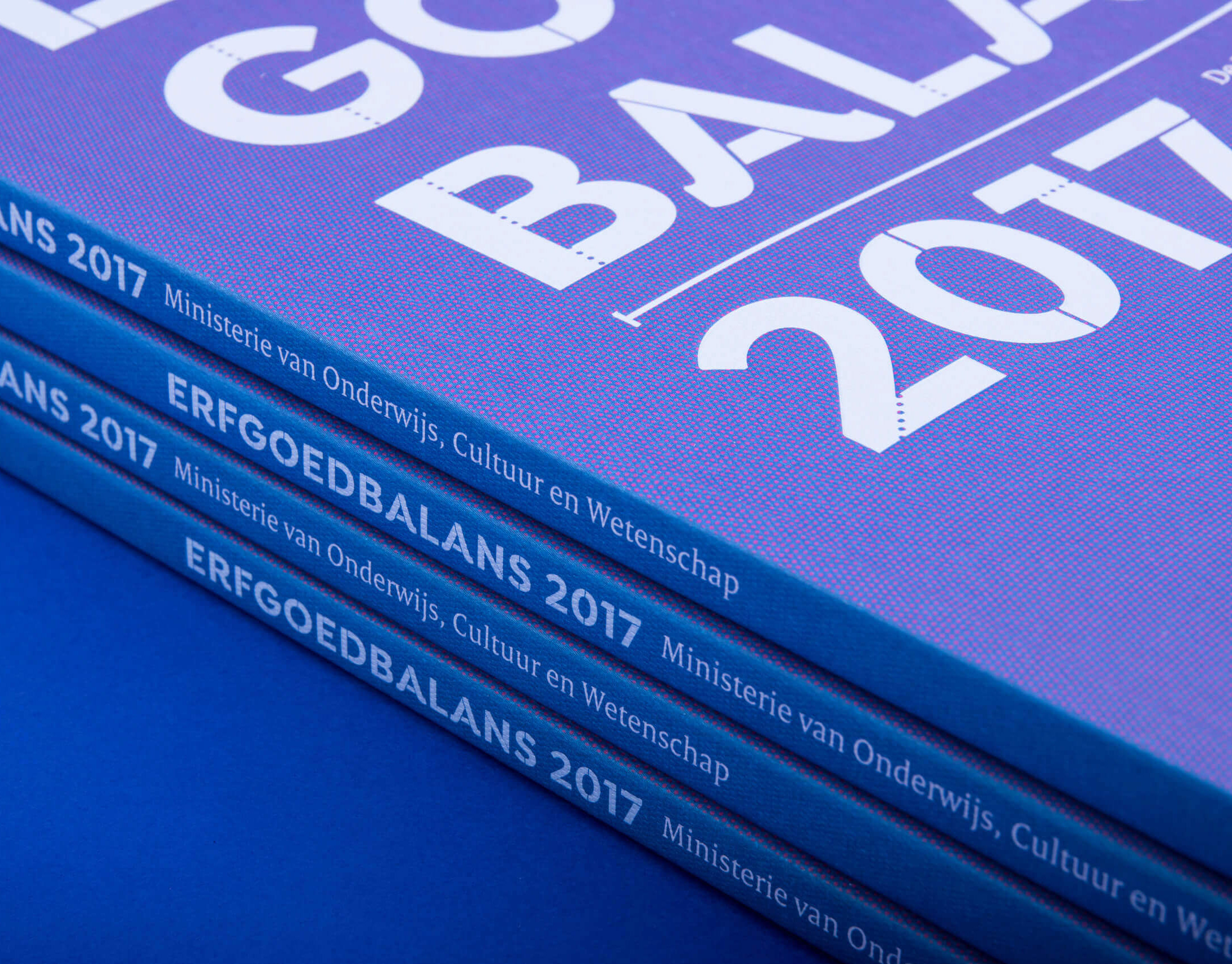
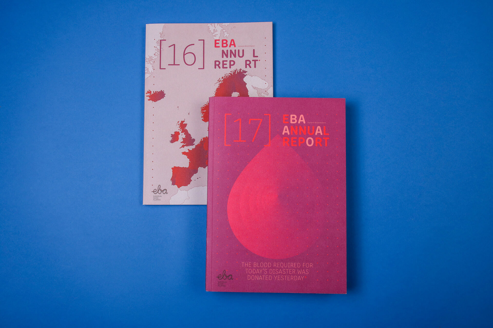
Annual reports, digital and printed version, B5, 80 pages, full colour print, foldable poster, strategy document

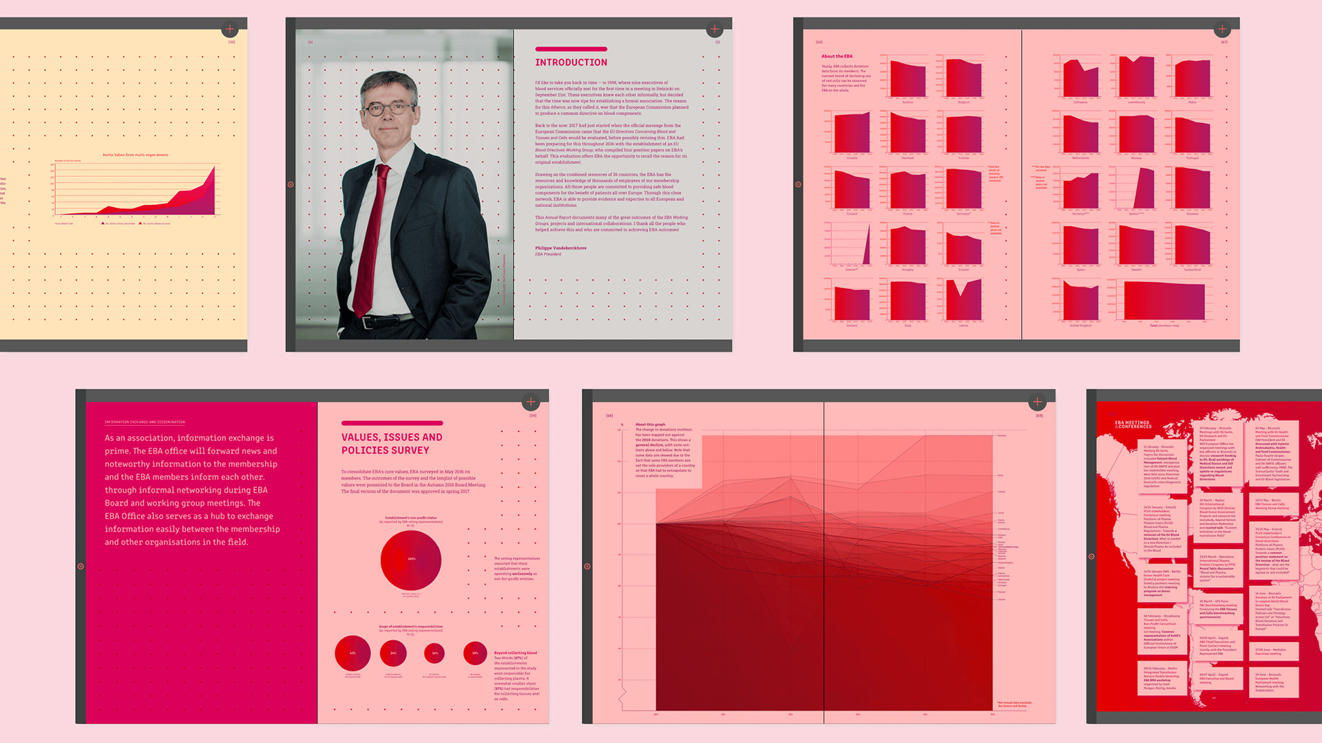
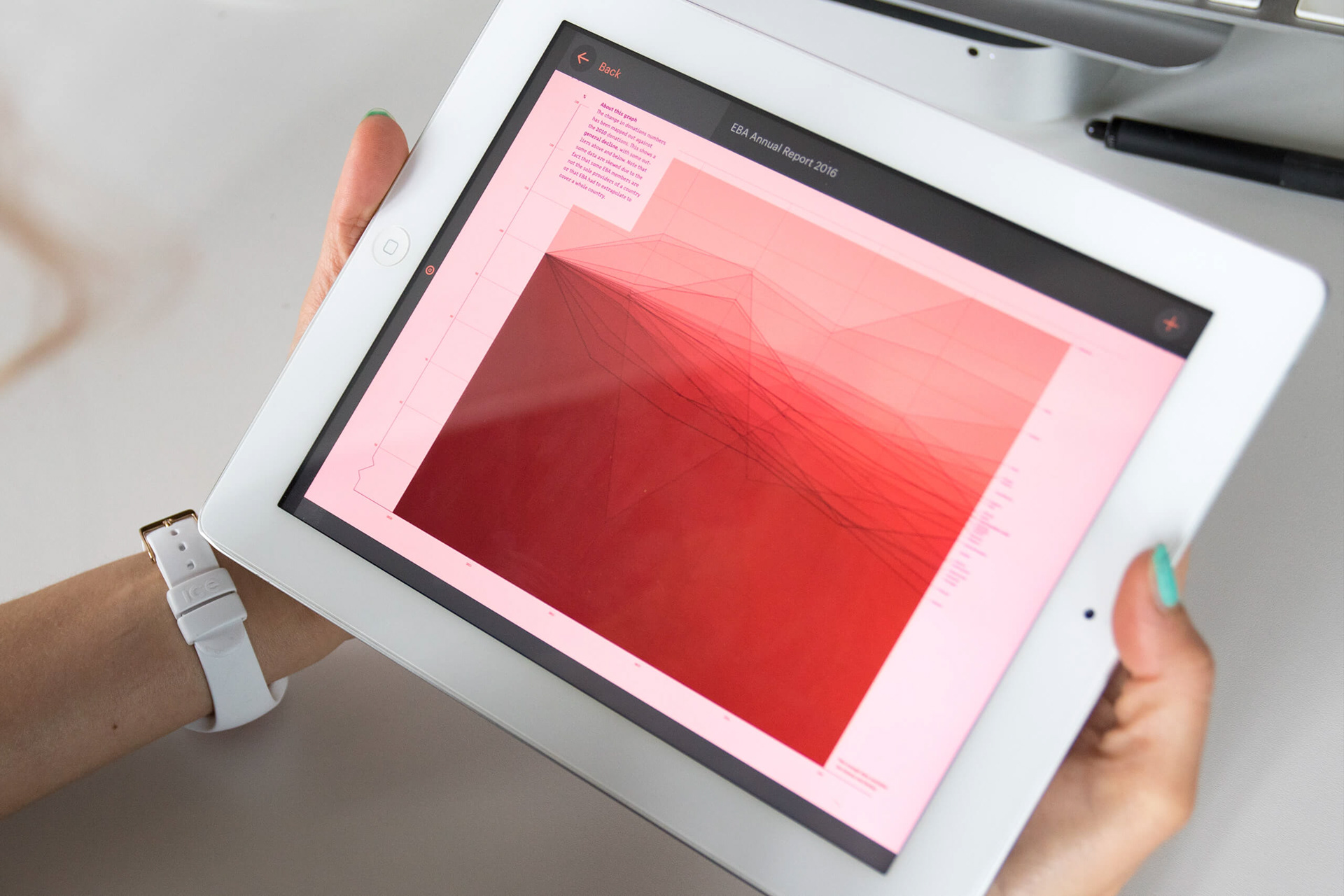
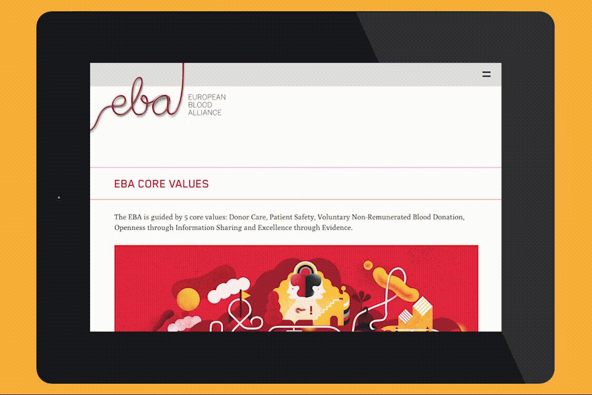
The annual reports were initially designed for online viewing and were published via the online magazine tool Issuu. Soon the request followed to print the reports, converting them to a B5 format with red thread binding.


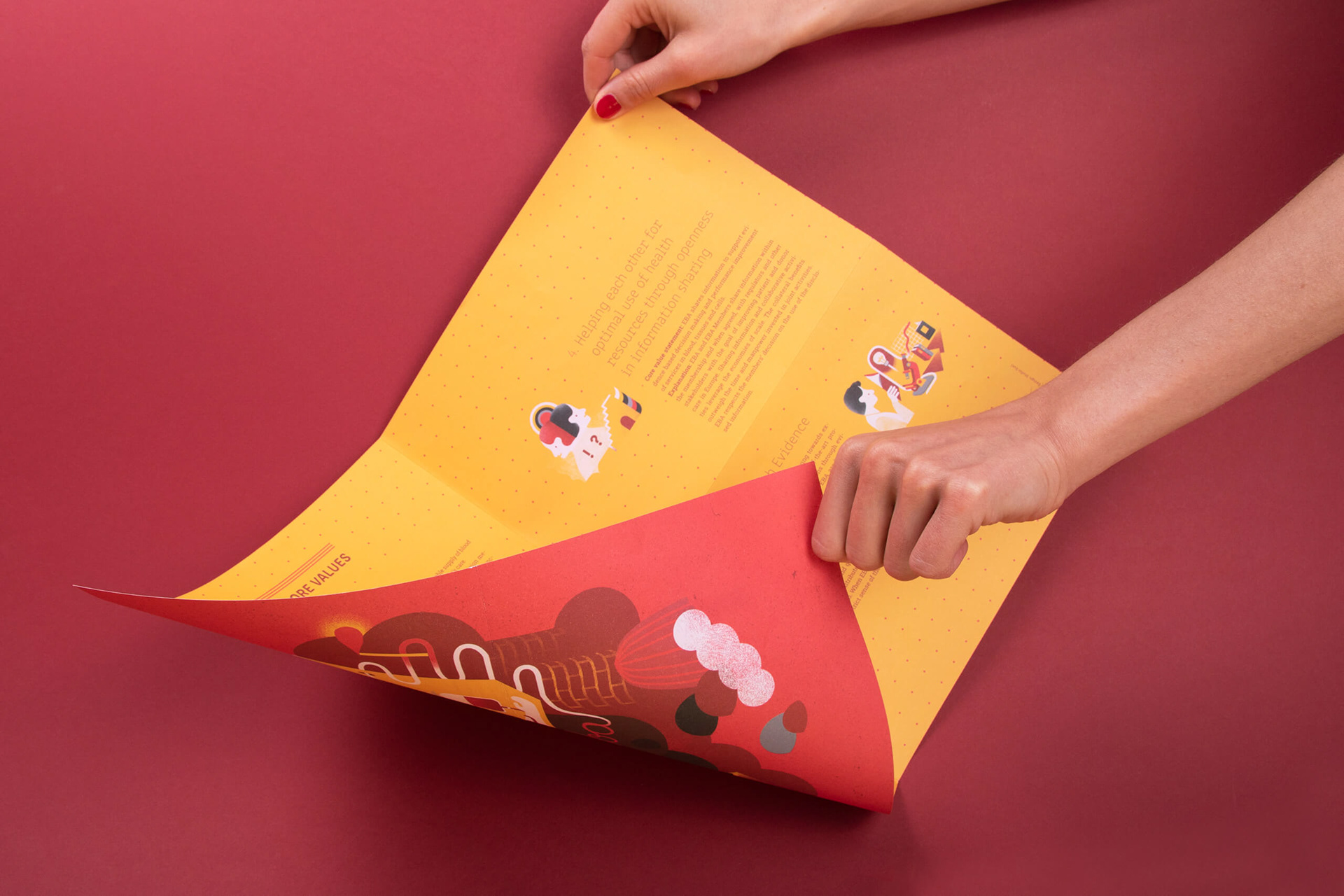
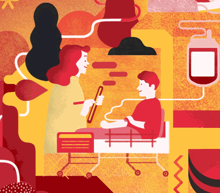
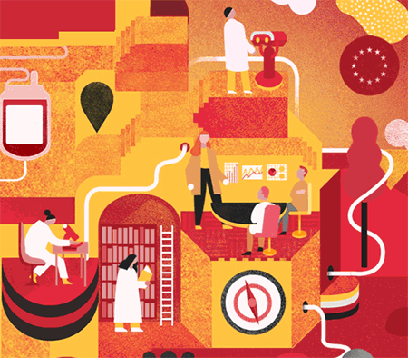
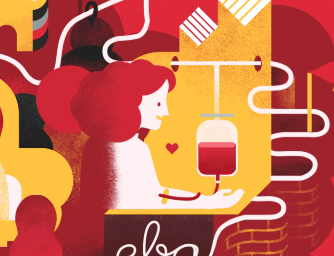
For the printed version I created a foldable poster that shows the five core values of EBA. Rafael Varona created the illustrations.

Strategy document EBA asked our studio to come up with an idea to visualise their strategy document. Since this would be mainly used online I suggested working with animated gifs and looked online for illustrators who made animated loops in the specific style I had in mind. Rafael Varona turned out to be the ideal person to do this. Working within the EBA colour palette, this collaboration resulted in several animated loops showing the combined and single core values that were implemented on the EBA website.


Process
EBA is an organisation that mainly consists of scientists from different fields. Their visual language used in PowerPoints and online was not of the professional level we had in mind. By designing the annual reports and the strategy document, the organisation now has a visual language that is more their own.
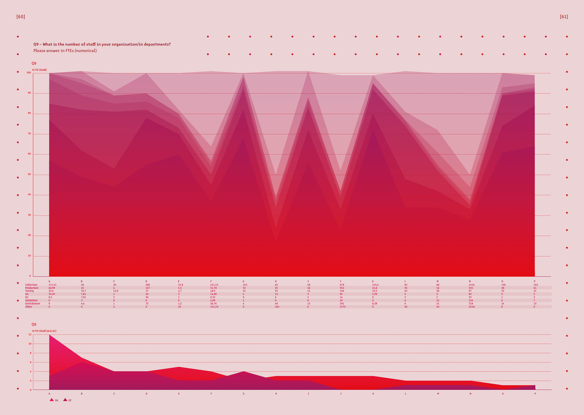
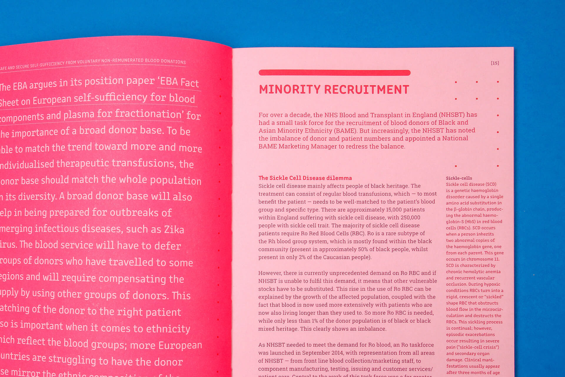
A big challenge for me personally with the annual report was the data visualisation, turning abstract data from countless Excel sheets into visually appealing and readable graphs. The different tints of red and the different shapes of the graphs create a strong and clear style. The layout is quite straight forward, but the grid of small dots makes each page a bit different.
I'm most proud of the fact that EBA agreed to work with Rafael Verona. A big step for an organisation who is used to scientific illustrations and microscopic images. They now use the images we created for all their communication and conferences.
This project was done as part of my work at Studio Duel.