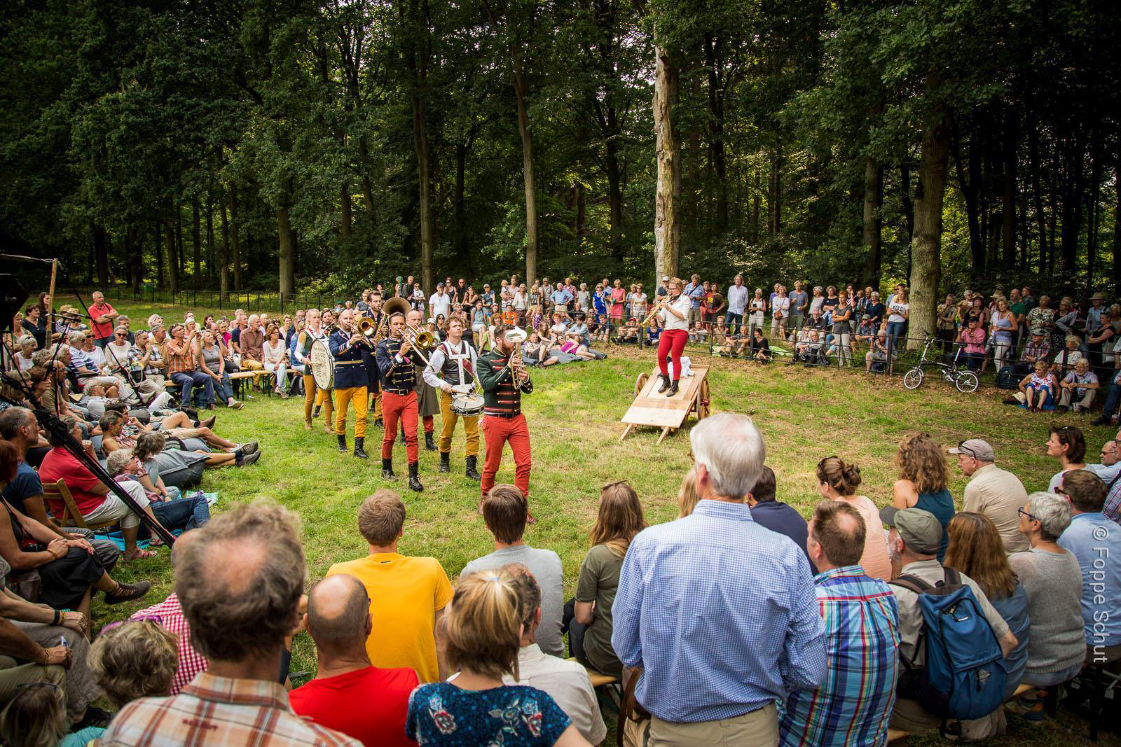
Neo-Fanfare 9x13 makes musical theatre without words, a new form of music based on the Dutch "fanfare" (marching band) tradition. This group of cool musicians asked our studio to design a logo for them. A straightforward question, but how to capture "neo-fanfare 9x13" in one image?
Logo, branding, silkscreen printing, animation
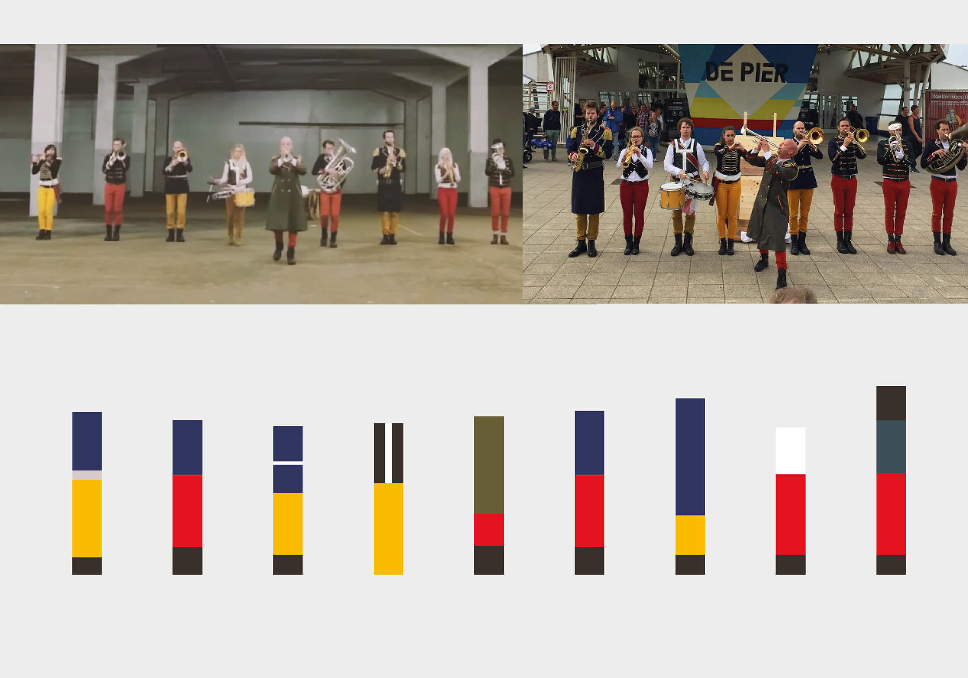
I started this assignment by analysing how they performed live and made colour bars of their distinctive clothing.
Process
The budget for this assignment was very small, a day’s work at best. After I analysed their live performance, I focused on the colours of the outfits as well as the details in their clothing, the aiguillettes and epaulettes.
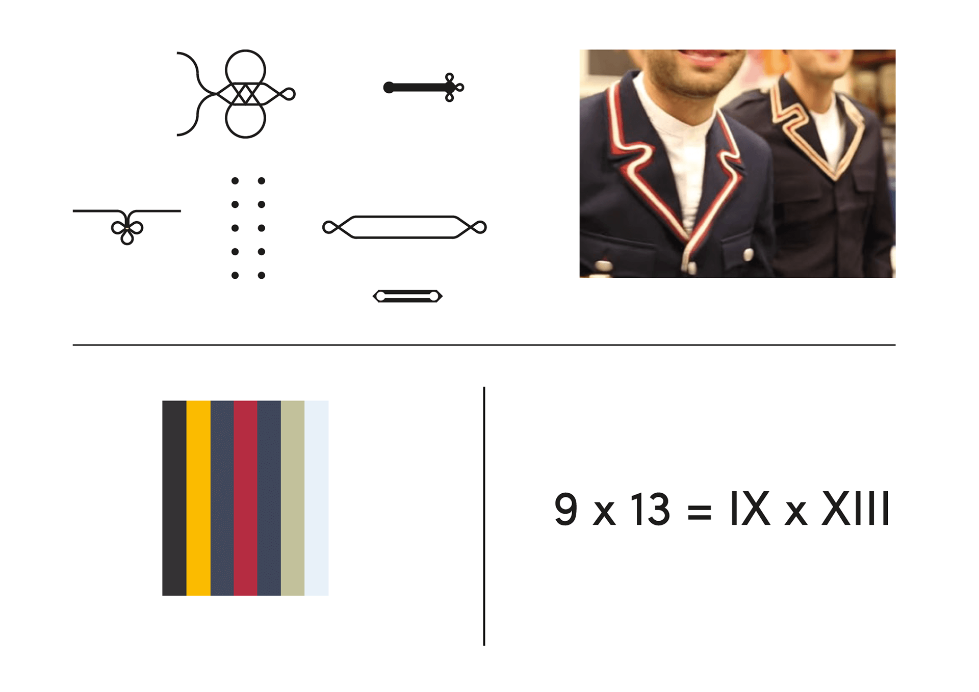
My analysis before making the logo: epaulettes & colours of their outfits and transforming 9 x 13 into Roman numerals.
IX x XIII x 90° ↻
The "9 x 13" was too mathematical looking and I decided to translate it into Roman numerals: IX x XIII. By turning it 90 degrees clockwise, the reference to the classical fanfare jacket was created.

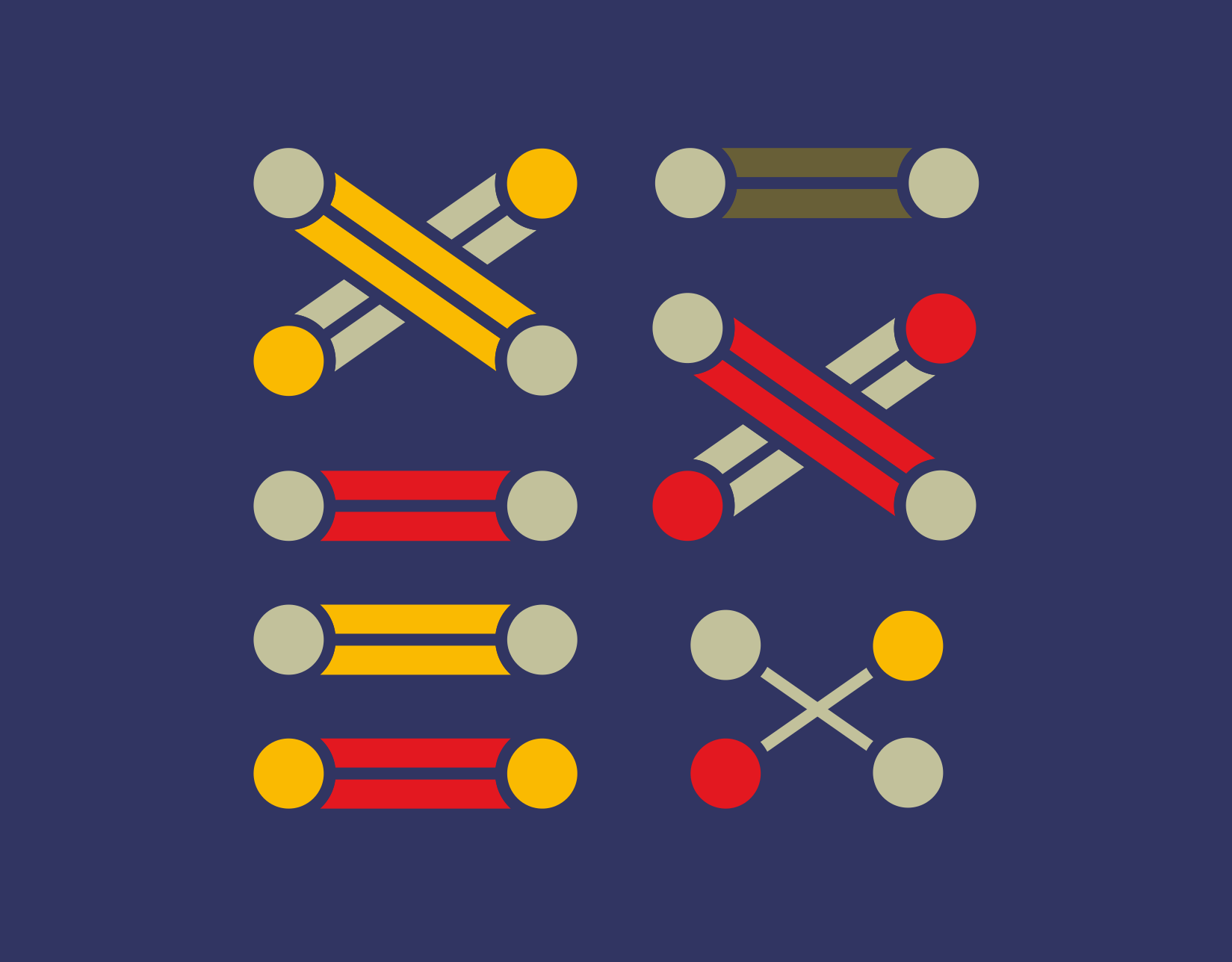

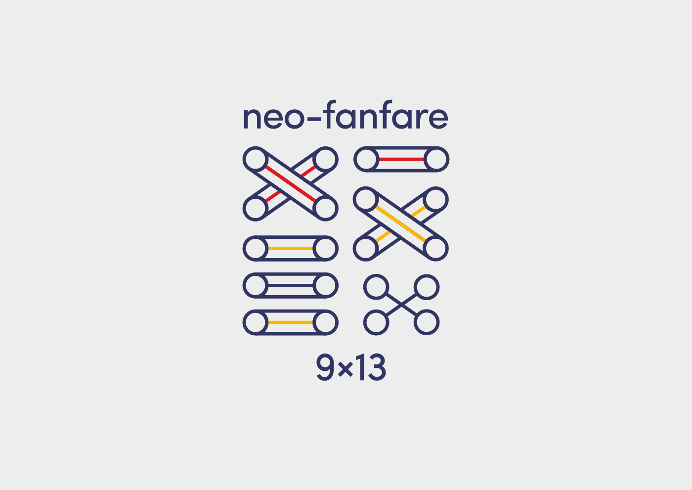

The logo is playful and can be used either in outline, parts coloured in as well as in black and white and monochrome.
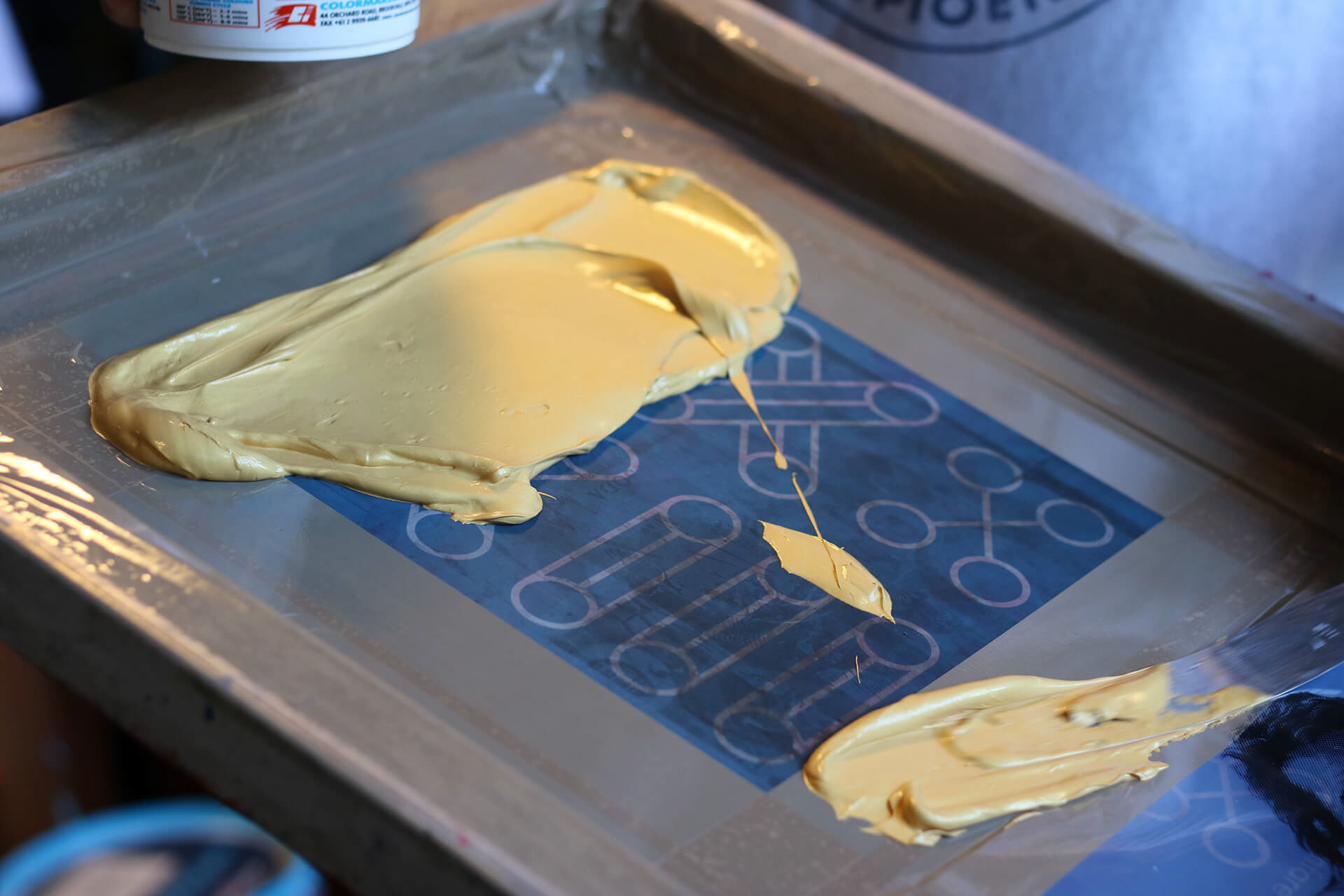
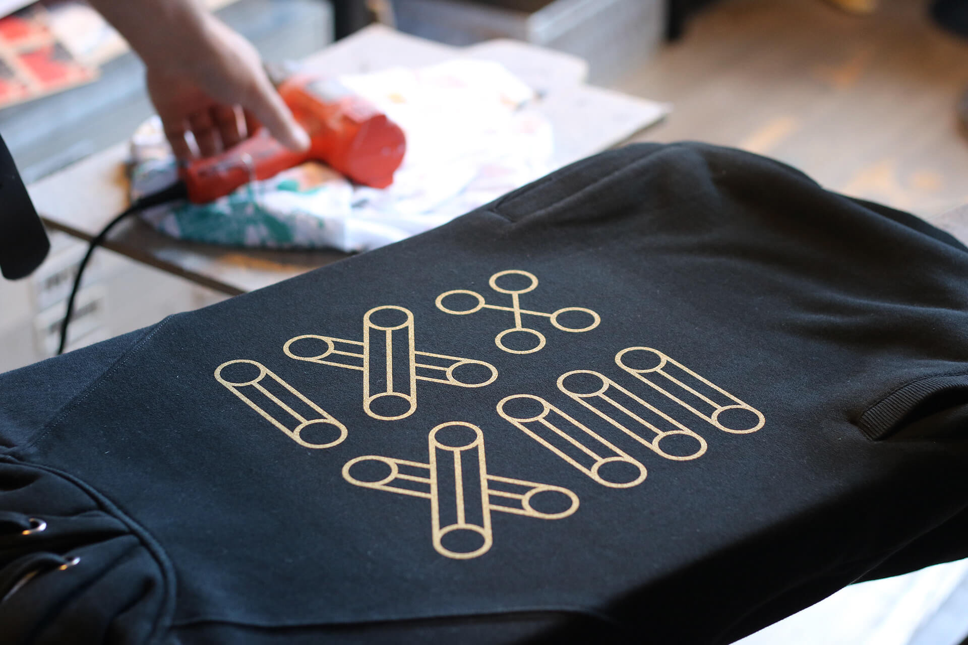
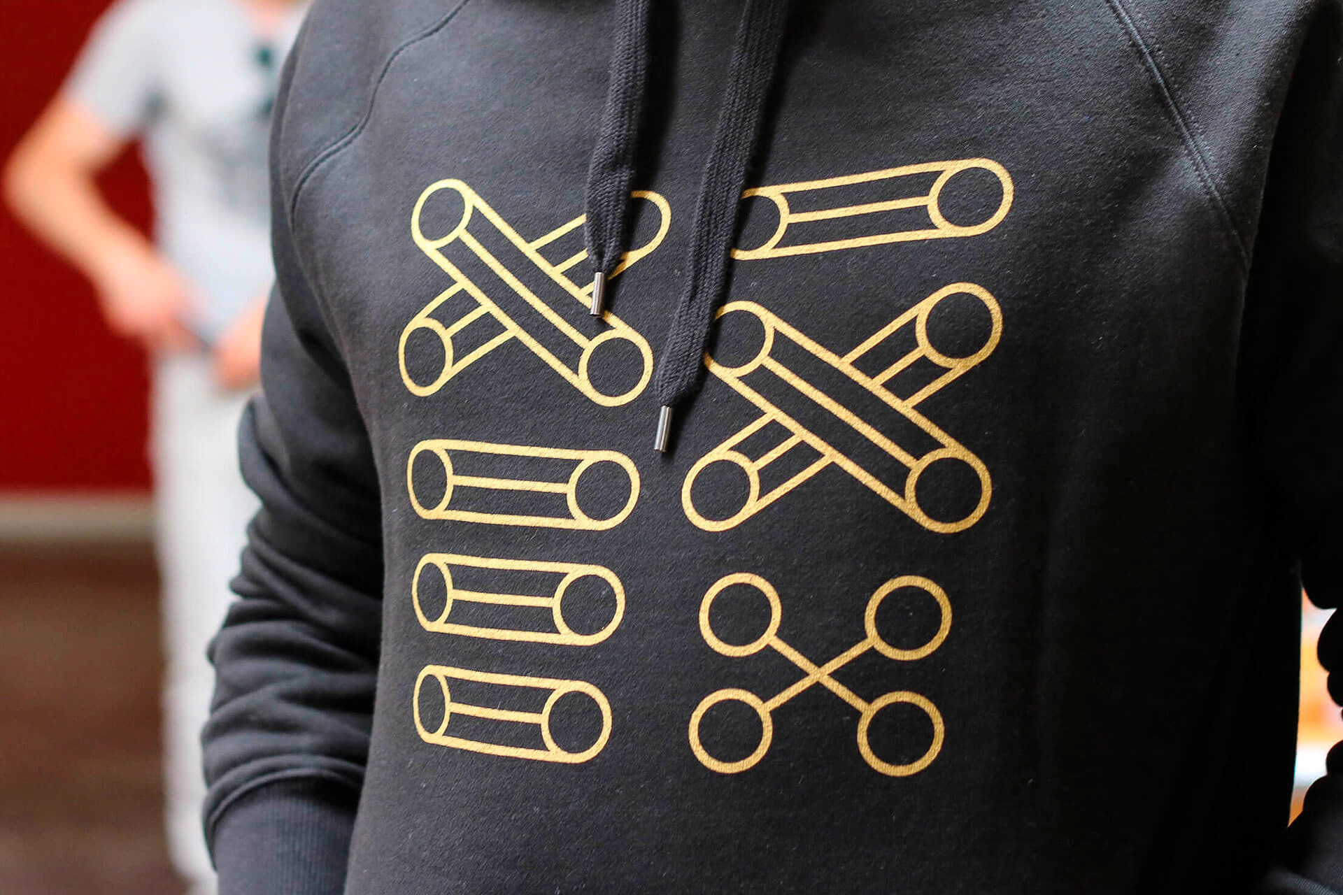
Using silkscreen in gold, the hoodies that the ensemble would wear after the concert matched their performing outfits.

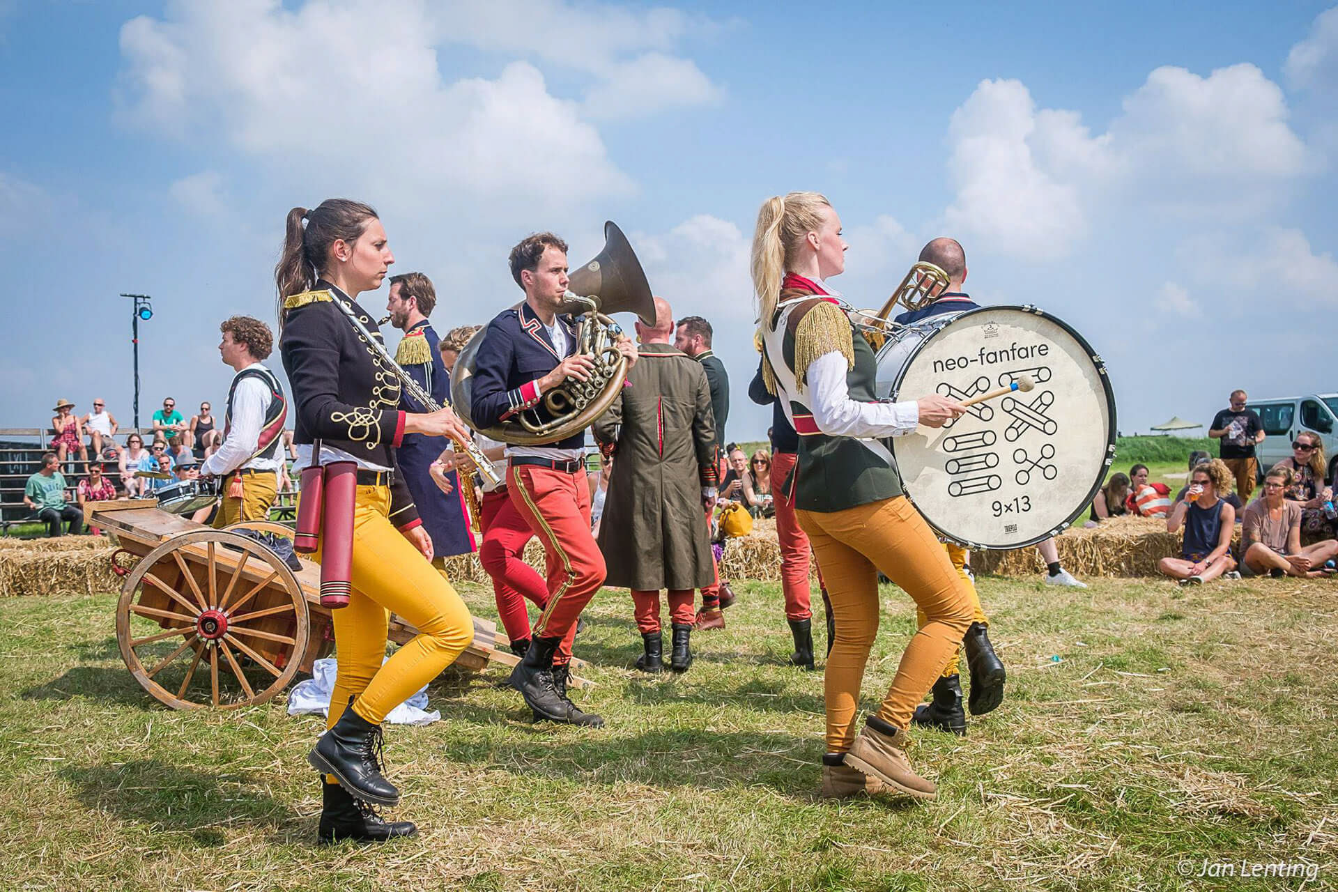
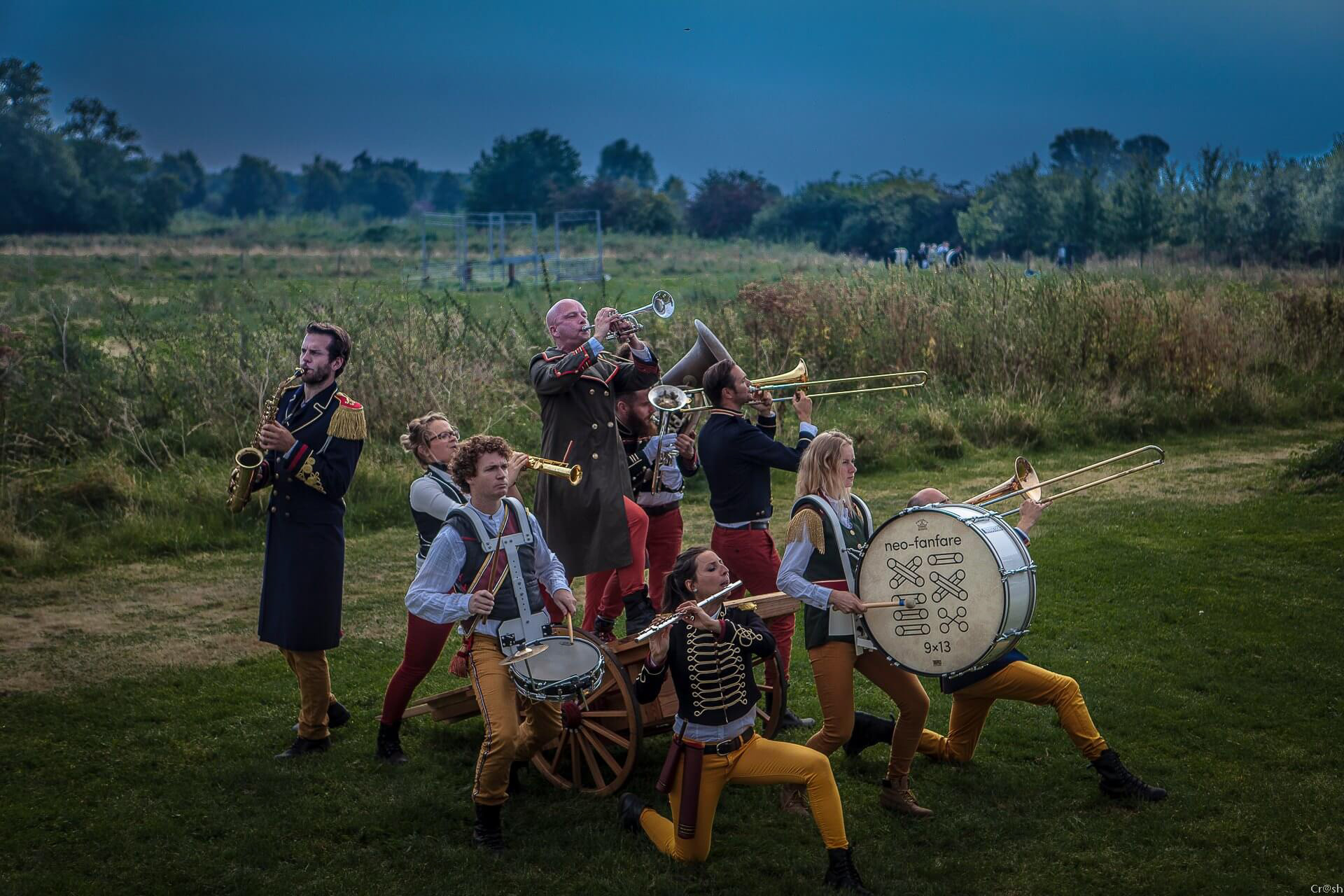
A simple sticker of the logo on the bass drum.
This was a small but fun project. It made me realise that a simple idea can sometimes be enough to do the trick and it was a nice short break in between larger and more serious projects.
This project was done as part of my work at Studio Duel.